PROJECT OVERVIEW
Swift Exchange allows users to manage their many loyalty programs in one place, and also allows users to easily redeem their points. Swift Exchange came to Rokkan to create a simple interface for a potentially complex form of payment, where users can pay for items online or in store using a combination of differently loyalty/reward points and cash.

SECURE YET EASY TO USE
One of the biggest debates in this project was the initial registration step. Because Swift Exchange was a new program and needed to get people to register, we had to figure out how to have the least amount of steps possible. We knew that if the registration process was complicated and long, users were not going to even bother participating.
Was the proposition value of being able to pay with reward points worth the time it takes to set up an account with all your reward programs?
After Swift Exchange internally worked out a way to get all of the user’s programs just from their email address, we knew that we could keep that all contained in one step. The only issue was whether or not the user would feel violated that we were able to get all of that information from them just by their email address. What we ended up doing was coming up with two versions that we could test with a prototype.
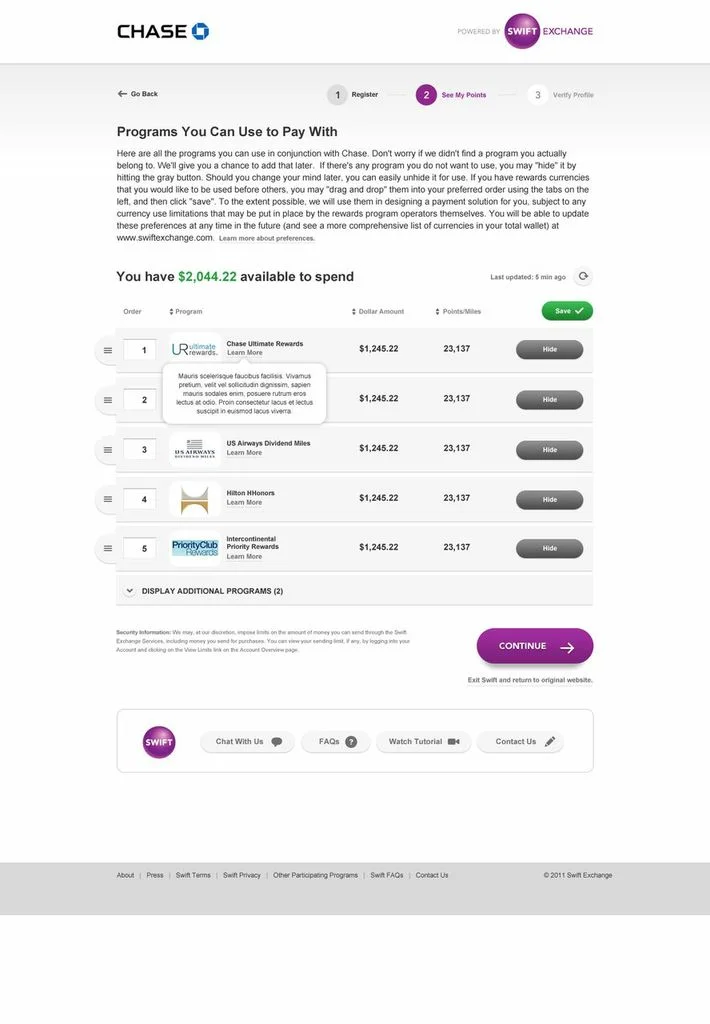
One version allowed the user to automatically connect to all of their reward programs. They would be able to disable specific programs that they did not want connected to Swift Exchange.

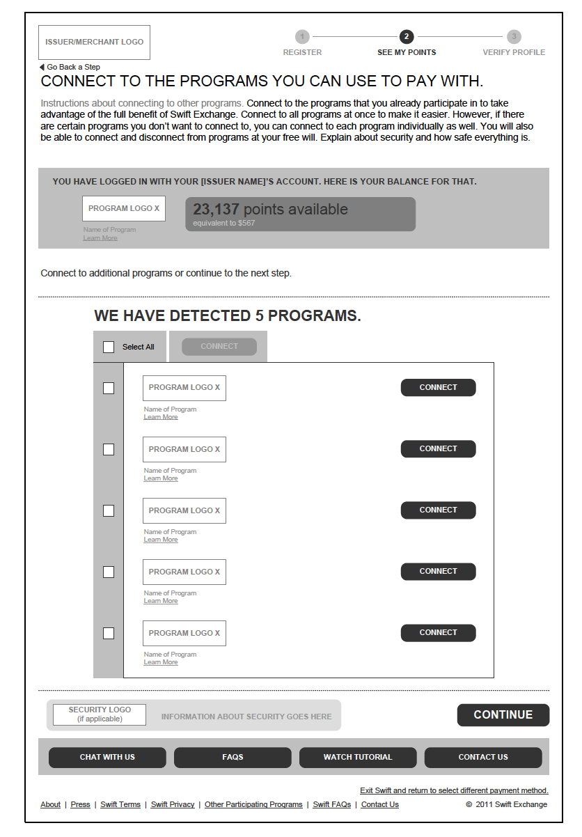
The second version displayed all of their reward programs, but the user would have to manually select which ones they would like to connect to Swift Exchange. This gave the user the impression that they had some control over their personal information.
SIMPLICITY IS KEY
Every part of this system was very complicated. We had to work hard to keep the complexity out of the user interfaces. Some of the complexity came with the nature of the system. Specifically, there were brands that couldn’t be combined with other brands (i.e. Amex and Visa or American Airlines and Virgin America).
How much would we have to educate users for them to understand the rules? How much control do we give the users? Should we allow them to manage their wallets and decide which programs they wanted to use to pay first? Could they adjust how much of each program they could use to pay?
In the end, we provided users with different automatic payment solutions with the correct brand groupings so that they could easily checkout without spending too much time deciding which reward points to use. We also gave the option to the 'power user' to manually adjust the payment solution to their liking.


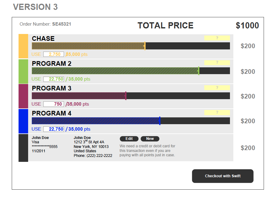


We also ended up allowing users to manage their wallets which contains every loyalty program that they choose to be a part of this program. Users could re-order their wallets so that the automatic solution provided to them was based on their customization.


INTEGRATE AT ALL TOUCH POINTS
After thinking about the desktop payment engine, we needed to think about the whole product experience including the mobile experience. The idea was to be able to allow users to use their mobile device to pay for products at any participating store. Since the mobile interface is even smaller, we needed to really make sure that everything was simple and easy to use. Not only did we want to allow the users to pay, we showcased deals that were in the vicinity of the user.
